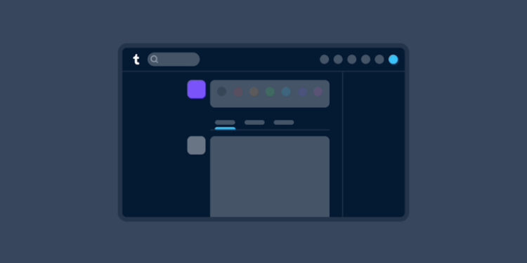
For web browser users of Tumblr, the past month has witnessed tests for a revamped dashboard navigation. This isn’t just a random facelift but an effort to simplify the platform’s navigation, ensuring both Tumblr novices and pros can swiftly find their way around.
Historically, Tumblr’s approach to feature additions was more visual – a new icon would appear without much explanation. But, after realizing users are hesitant to click unfamiliar buttons, text labels have been introduced where they fit. Interestingly, this seemingly minor tweak has emboldened users to explore previously untouched Tumblr territories.
The testing phase, driven by user feedback, has already led to tangible improvements. A noticeable change is the repositioning of settings subpages like Account and Dashboard, which now reside to the right of the settings page, unlike before when they were buried in expandable navigation sections on the left. Also, users with smaller screens no longer face the previous messaging window issues, and accessing individual blogs via the Account section is now smoother.

For those flaunting bigger screens, Tumblr is mulling over a collapsible version of the navigation, ensuring effective screen space usage. Simultaneously, efforts are on to refine access to main accounts and sideblogs.
In the dynamic realm of social media, user experience is king. By reimagining its navigation, Tumblr is not just keeping pace but actively addressing user pain points. It’s a strategic move, signaling the platform’s dedication to refining its user experience, ultimately catering to the ever-evolving digital audience’s needs.


